There’s a new trend in email design: hero images. Now, these images might not have super powers in the traditional sense, but they will work wonders on your email campaign. We’ve seen this trend start in web design, more and more websites are employing the use of hero images, so it’s only a matter of time before email design caught up.
So what is a hero image?
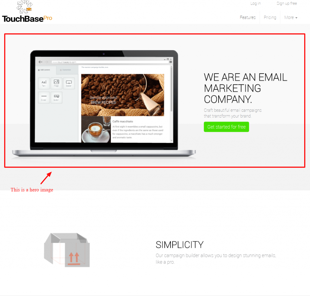
The trend of hero images can be summarised as a large, attractive header or background image. It’s a term that has been adopted from the print industry where page filling images are commonly seen in magazines. Websites today are using hero images as a form of introduction, with clear, compelling text over edge-to-edge images. This spruces up the design, gives a precise look and feel while compelling users to a call to action, as well as generally wowing the users that visit.
And, as usual, where website design goes, email design is sure to follow. Marketers want consistency across all digital channels, so that they can maintain a brand experience no matter which platform they are engaging with their customers. Luckily, with TouchBasePro’s drag-and-drop campaign builder, you can easily incorporate hero images into your email campaign design.
How do I choose the right hero images for my campaign?
A hero image doesn’t necessarily need to be a photograph, you can use vector illustrations or illustrated artworks. However, hero images should be designed to complement your brand and your call-to-action, as well as make a good first impression.
Think of your hero image as a visual support for your brand and your motivations. Choose something that is just as strong or moving as your statement is, and make sure your statement and visuals are saying the same thing.
Remember to be relatable to your audience as well, you don’t want to turn someone away from your brand because they can’t relate to you. Be mindful to set a scene that will resonate with your customers’ personas, so choose images that are reflective of your audience.
If you’re focused on selling one particular product or series of products, show it off! Make your product the focus. Idolise it and make it larger than life, this will make it more alluring and more important than a little catalogue picture.
How do I add a hero images to my campaign?
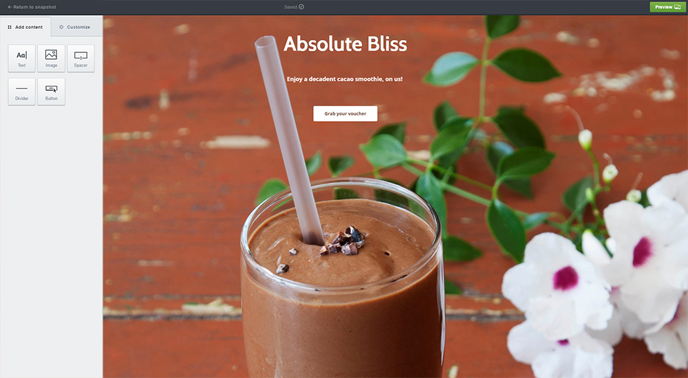
You’ll add hero images to your campaign by using Layouts. Add your background image under the Background and Border section, just remember to make it wide enough to look good across a variety of different screen sizes. It’s also a good idea to match your background colour to your design, in case some email clients don’t load the background image.
Once your hero image is in place, you can drag and drop a text section over it, and don’t forget to include a button for your call-to-action. And that’s all you need! Now your email campaign design has gone from good to super!
Be sure to check out our helpful email builder guide for more in-depth instructions.


